My Personal Investigation
"I think most of us go through our lives partially asleep. Even though our eyes are open and we're out in the world, we're daydreaming or we're distracted in some way. But when I make a photograph of something, at that moment I feel in a very precise, conscious, alert, awakened state, even if it's only for a split-second. And for me that's the joy of photography: to be connected to things in the world that are suddenly of conscious value."
Joel Meyerowitz
Joel Meyerowitz
Dream City
Exercise No. 11:
Imagine that your nearest city (or a more distant city you may have visited) only existed as a dream, perhaps the kind of fantastic city written about by Italo Calvino in his book Invisible Cities. Photograph this dream city. There are no restrictions about how you might interpret this assignment, so use your imagination. How can you use factors like the time of day, colour, movement and details to evoke the mood of your imaginary, dream city.
Think about how sequences of photographs can create a new reality from an existing one.
I chose this exercise because I felt there could be a lot that I could do to respond in a way that I haven't ever attempted before. I started by researching two recommended photographers whose work relates in some way to the prompt, these being Rut Blees Luxemburg and Lewis Bush. I chose to research these artists as they both seemed like two opposite interpretations of a similar idea.
Rut Blees Luxemburg
|
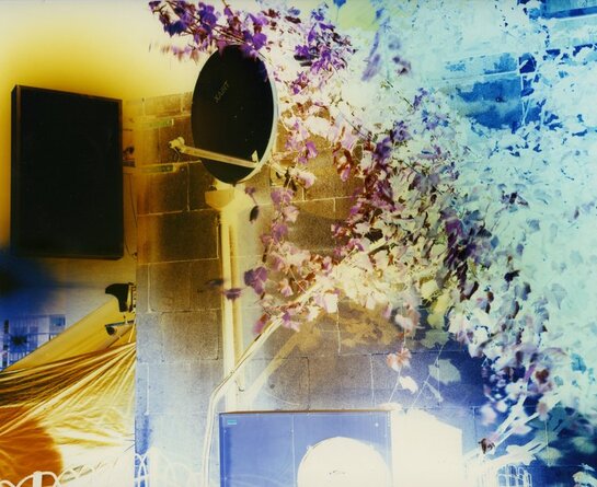
Luxemburg is a German photographer who specialises with night photography, in the specific project I'm researching, "Eldorado Atlas" bright colourful lighting across large empty surfaces. Though the yellow lighting is clearly projected from a source above the camera, the wide wash of light in these photos create the impression that the atmosphere surrounding the camera and outside of the picture being taken is completely covered in both golden glows and cool cyan. Using these pictures, Luxemburg is able to document and present a reality that doesn't exist into our own more bland and grey world. Not all of the pictures in this project are lit in the straightforward traditional way which require minimal editing: the picture to the right, titled 'Urban Harvest (Summer)', is an inverted picture of a concrete wall covered in flora, with a satellite mounted to it and illuminated by a large light box emitting. When picture was then inverted later to aesthetically match the others in the collection, the warmer areas in the original raw picture now a cool blue in the final piece. The picture was probably taken in the same process and similar conditions as the others were but Lumenburg probably used cool lighting instead of harsh yellow to experiment with the process of digitally inverting.
|
|


Lewis Bush
A British photographer, Bush's 2016 project 'City of Dust' presents London in a darker and possibly a more sinister way. Bush focuses a lot of his work on symmetry. A lot of his work have even lines and sharp corners that surround or build subjects in the frame. Some of these compositions create what I associate with the shapes of doorways, which I think could allude to there being a deeper meaning to each of his photos. Each of Bush's pictures look as if they are a single piece to a larger story, wether its the start, middle or end. For example, the picture on the left draws the viewer in to the subject and pushes them to ask what's behind the doors; the picture in the middle shows a man on a horse, two living beings in the middle of the frame, near-perfectly symmetrical; and the one on the right depicts a broken and dirty pavement, leading a viewer to wonder about the history of what walked over it before, why is it in the state that it is.


I like the black and white aspects of the photos as it makes the contrast between tones a lot more obvious and protrudes to the front of the image. The darker areas in shadows lead a viewer in and the highlights push any surrounding subjects out towards the foreground. These visually direct aspects lead me to believe if 'Eldorado Atlas' represents a Dream City; 'City of Dust' communicates the same ambience of a nightmare.
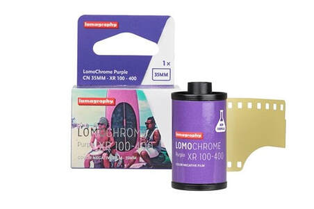
LomoChrome Purple XR 100-400


|
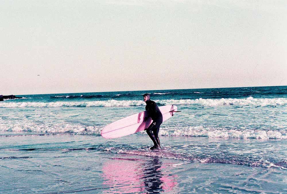
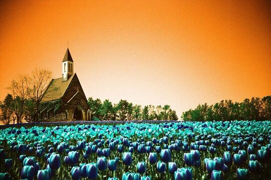
As soon as I read the name of the exercise, I knew I wanted to produce a response that carried an etherial atmosphere and or a visually dream-like quality. To do this, I chose to order a roll of LomoChrome Purple and LomoChrome Turquoise. Both of these rolls of film are developed by a company called Lomography, who specialise in producing new or reinventing more traditional colour film. Going to shoot the film, I decided to use the purple roll instead of the turquoise as when I compared the examples I had seen before, I liked the softer look of the purple and green hues more than the turquoise roll. Although the turquoise would create similar looking colours as the work of Rut Blees Luxmberg, I felt the blue and orange in each example picture I'd look at would always contrast each other in a more chaotic way than purple and green.
|
|
|
|
|
"Carefully crafted by our color contortionist chemical engineers, the latest batch of LomoChrome Purple film was fermented in a top-secret location and allowed to mature to perfection. A delicate balance of the finest photon reactive silver halide crystals and special color compounds, this trippy emulsion yields spectacular psychedelic scenes. Use it to turn this beautiful, bizarre and bewildering world into a wonderland. Explore the color spectrum like never before from pastel pinks to mighty magentas and intense indigos. Lomography LomoChrome films are totally unique. With special chemical formulas and trippy emulsion concoctions, we have crafted some of the most experimental and extraordinary films on the market today."
|
My whole roll
These rolls of film presented new challenges to me as I had up to this point only ever shot black and white analogue photos. Whereas before I had to start adapting to the presence of tone instead of shades of colour, now I had to start reincorporating that awareness of colour with the intention of subverting it using the film. Also, when I went to shoot this I had to start thinking about changing the ISO of the film as I shot the roll, something which I had never had to do using analogue photography. This is because of the films chemistry causing the colours to appear more saturated and bolder while on a higher sensitive setting like ISO 400, or appear more washed and pale when set lower like ISO 100. Aside from those issues I encountered, I also had to do my best to find the right settings for every different lighting condition without the use of a light meter as the camera I was using (Pentax SP100) did not have an operational one. Looking at the majority of my pictures, I think the I found the correct balance of bright and dark areas, - although I did struggle with shooting constantly with the appropriate aperture for the first couple photos, and for whatever reason there were a few instances where I used a shutter speed that was too slow for the motion of the subject I was trying to photograph - but in both cases I managed to fix these issues without wasting any of the exposures.


Dream City - Collection
Eli Lotar

|
Eli Lotar is a French photographer, his work being very prominent in the 30s and representative of the surrealist movement of the time. In some instances his images capture the mundane elements of architectural photograph or street photography and push the boundaries of what could border "dream-like" through the framing and the composition. In the example to the left, the image uses leading lines to direct the focus of the viewer into the centred area of the frame, both through the corners of the walls, ceiling and floor leading into the centre point - and the repetition of the half painted archways on the left wall of whatever structure there is here. The composition lead all attention to the direct centre of the frame and to a door way, possible trying to convince the viewer to wonder what is beyond and why they are being led there - but I think this is intentionally done for the specific purpose of leading the attention away from the flat hand and the stopwatch laying on it. This addition to the bottom portion of the photographs composition creates a new set of questions and introduces a new possible context. Once a viewer has looked at the image enough to notice the hand, they start to wonder Why is it there? what does it means? Is it important?. Lotar's inclusion of the pocket watch in this way leads me to ask whether time is an important theme in the photos story or context. The hand stretched out so nonchalantly and the watch laying face up as if something from the centre of the frame is connected to the time being measured and the figure that the hand belongs to is recording these important readings. This fragment of a story that I was able to find without a start or ending is the reason I think Lotar's work fits the prompt "Dream City" as it is often the most abstract concepts from dreams ripped out of context that we are able to remember when we wake up, moments we create that seem so important but lack the means to provide reason.
|
|
Lotar's other work is very similar to this example as they present the small moments that could easily be part of larger more obscure narratives. The picture on the far left leads to the more obvious questions like who is the person made so small by the scale of the unexplained explosion behind them, and what could have happened to put them in this position. But the more simplistic compositions of the other photo can also lead to similar questions like where it takes place what is this sign and what does it advertise.
|
  |
These photographs are at first glance very standard images and they produce typical questions that anyone would be able to easily attempt to answer - but, that leads me to start believing that any picture, abstract or straightforward, can represent "Dream City" when stripped from the context and familiarity the audience have to similar situations or settings in images they might take themselves. My interpretation of what this theme has prompted me to create is the response of an audience asking why something looks so familiar but carries an atmosphere that causes questions to be asked, and I think Dream City is
Luigi Ghirri


Ghirri is an Italian conceptual artist and photographer who's work blurred the line between the real world he photographed and the fictional reality he tried to portray. His main medium of work is architectural photography and with a large focus on the relation to people or lack thereof in the composition of his pictures. I am interested in the colour of Ghirri's photos as they remind me of my own work in response to the first exercise I did, as they create a soft and vivid atmosphere in the frame, in a time where colour photography did not have a place in galleries and exhibitions.
|
Ghirri used a 35mm camera to capture landscapes and portraits of buildings or general environments; using softer, washed tones to create typically warmer environments. I like this picture because it adapts the composition of a traditional portrait to fit the landscape being photographed. The tree at the very centre of the frame takes the place of a person in a typical portrait
|

|
Photographing my exhibition
      |

|


Sunny 16
A struggle I often face while getting used to shooting on film is exposing my pictures without using a light metre. Doing so, I leant a technique called, "Sunny 16" which I used as a guideline to exposing my pictures properly on a sunny day. In calss I wanted to leave with a digital camera to practice this in a different medium of photography. I set the ISO and Shutter Speed to correspiond with how I shoot film (400 speed film at 1/500 of a second) and only changed the apperture throughout my whole shoot. The camera I had used would allowed me to shoot up to f/22 but I limited myself at f/5.6 to f/16 as that is the highest my analogue camera can close to and the digital camera I was using could not open past f/4.


Re-photographing my exhibition


Why do you currently take photographs
Printing

|
I wanted to develop my use of film a bit more by printing my images onto a larger piece of photographic paper in the darkroom. I had to correctly measure and mix the develop, stop and fixer with water then pour them into their respective trays. Then, I had to create a contact sheet and to do this I laid all my strips of film down over the paper and used a glass panel to flatten them down. While doing this, some of the strips had moved and shifted around so they weren't all in the even straight lines I had organised them into. After using the enlarger to expose my paper, I let the paper soak in the developer tray for about 2 minutes before moving it into the stop and then fix. In total I made 2 contact sheets like using this method and due to stains that appeared as the paper was washed in the first tray. I think these are due to the chemicals not being mixed agitated after pouring them into the tray so the second attempt at this print worked a lot better, though there were still faults.
|
|
I then chose the frame that I wanted to print, I went with a picture I took around the school's car park of a few palettes lined up leaning over each other as I though the exposure worked best in revealing both shadow-covered and highlighted areas. Next I took the strip of film to the enlarger and put it into the projecting frame. After this I cut a piece of photosensitive paper to fit into the print tester and lined it up underneath the most focussed part of the projected image through the filter. After I positioned the test correctly, I used the enlarger without the filter two stops down from a wide open aperture, moving uncovering the strip every two seconds for a total of 12 seconds. I liked the contrast of the second section of the strip which was about 4 seconds long, though I thought the picture was being lit too much by the enlarger so I turned it down another stop.
|

|

I wanted to do a more specific test strip after making this adjustment so I didn't use the print tester, and placed the test strip over the same area as before. I decided to cover the one half of the picture for three seconds and then uncover it for the same amount of time, causing one side to be exposed for twice the amount of time as the other. I liked the contrast of the left side (exposed for 6 seconds) but thought it was a bit two dark so I decided when I am to make my print I will expose it for a second less.

|
Making my larger print, I set my aperture two stops down and decided I'd expose the image for 5 seconds. Before taking out the paper I would use, I projected my frame onto the board and made sure my image was as sharp as possible by using a focus finder over the part of the image I had set my focal length to. Once my picture looked sharp and I could easily distinguish the grain through the focus finder, I used the filter to protect the paper while positioning the the sheet, then turned the enlarger off and moved the filter away from the lens. I had wanted to expose this picture for around five seconds but I think I might have left it a bit longer than I intended to. The picture seems quite dark in the centre but everything else has a nice balance between the highlights and the shadows. Making these prints makes me thing I want to start experimenting with the contrast and see if I can eliminate most of the grey area in between the blacks and whites. I know I could do this in light room but I would like to look into how I can achieve that in the stage of taking these pictures.
|
|
I didn't like the fact that the picture filled the whole frame so I decided to do it again and add a border. I did this by using the filter to frame the image smaller than the piece of photographic paper, so when I soak the image in the developer, a white boarder will form around where no light had touched the paper. I liked this a lot more as it give the picture a definite frame, whereas the borderless image looks like a central part of a larger picture that has had parts left out.
|

|
Mirrors and Windows

|
mirror window blah blah
|
takumatsu
|
My repsponse to windows


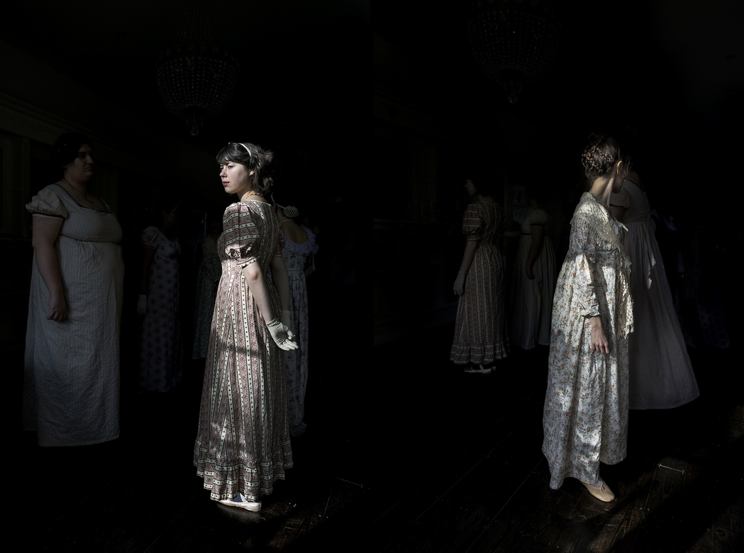
Alejandra Carles-Tolra
|
The photographer Alejandra Carles-Tolra came in to speak to us about a past project of her's called "Where We Belong". This project was specifically centred around a society she had met in a city in the north of the country after first moving to the UK. This group was called the "Jane Austin Pineapple Society" who annually meet in the city of Bath for a 10 day festival celebrating the aesthetics and work of Jane Austin's novels. She said this idea of community resonated with her as she was new to the country and didn't feel like she knew many people. After researching and beginning the project, Carles-Tolra started to learn a lot about these people specifically, and communities in general.
|


Our first task was to label some pictures on a line corresponding with how candid or "staged" we thought each picture was.


|
My response to Carles-Tolra
Responding to Alejandra Carles-Tolra, I created a different pictures over the span of a few days on my journeys home from school. These pictures each responded to a different prompt we were given after our workshop with the artist. These words were: Brotherhood, Candid, Community, Dreamlike, Escapism, Fantasy, Family, Fear, Freedom, Friends, Forced, Home, Liberation, Light, Painterly, Performance, Posed, Privacy, Reality, Resting, Same, Surreal, Togetherness and Understanding. Most of these can be understood fairly easily, such as the prompt "Friends" was responded to with a picture of my friends, or "Same" prompted me to take a picture of a person in front of me walking in the same direction I was. Other images were more personal and vague such as the "Community" where I pictured my neighbour who I've been in school for over 10 years. My favourite picture was "Togetherness" as the lighting worked well to create nice shadows without too much overpowering contrast. I like how the subjects being two empty seats sitting idly next to each other, reinforcing the idea of togetherness even when there are no people in the frame.


Hicham Benahoud
|
Benahoud is a Moroccan born photographer currently producing work in France. His work previous has been known to successful document people he encounters in interesting and unusual ways. As a teacher in the Morocco's strict education system, Benahoud quickly became bored with the reutine of his life teaching and began to instruct his students to perform for the camera in a project he called "La salle de classe" or "The Classroom". The compositions of pictures in this collection are fairly similar, most of them in landscape taken from a level height to the tables they work off. Each picture features one or two of Benahoud's students dressed up in long fabrics or frozen in dramatic poses for the camera - in the In background there are often children working in an orderly fashion, as if unaware of the performance in the centre of the foreground. This image on the right is my favourite of his collection as it differs from the others as it is a portrait in a collection of a majority of landscapes. The subject is a student of Benahoud straight up on standing on a stall in the middle of the room, motionless and isolated. I like that the student is elevated above the table level of their classmates yet they pay no attention to him, obvious due to Benahoud's instruction but I think the image itself is improved by the duality between the order of the background and the chaos of the foreground in front of it.
|

|


Portraiture
We were tasked with taking environmental portraits of peers in our class. While doing this, I wanted to think about my subject but also about the placement in the frame while also considering the contents of the background. I took an initial twelve pictures where I tried to match the subject and her clothes to the colours of the buildings or structures around her, which I liked but felt that the grey atmosphere the pictures had gained couldn be a bit boring or dull. So while I was having my portraits taken in the studio, I saw an opportunity to revisit the idea of environment in the sense that I could use gels and light boxes to change the pallet of a subjects surroundings. As long exposures is something I have been enjoying experimenting with in my other work, I saw an opportunity to create the impression of motion in a picture which I think opposed the still and uneventful atmosphere that my initial pictures had. While I was doing this, I had been reminded of a technique I had been especially interested in a a few years ago called light painting. Using long exposure times, a photographer is able to create lines in their frame using moving sources of light. Due to the slower shutter speed required to appropriately create sharp images, a lot of photographers mount their camera to a tripod, but the aspect that attracts me the most to this technique is the ability to physically move closer to or away from the subject, or even zoom in or out while the picture is being taken - ruining already established senses of scale or capturing the same subject in completely different actions.


My unconventional interpretation to light painting might be something I want to look into or adapt in my other projects involving colour or light, such as possible street photography in interesting locations. But if I were to look into portraiture more, I think I'd want to explore faster shutter speeds and focus on my use of deep and shallow depths of field, as I think though the technique I used today can create some abstract or visually interesting images, a an aspect of my portraits that I haven't given much thought to is a clear picture of the subject and who they are, as if I'm taking a picture about someone as well as of them.
|
|


On another day we went to refine our portraiture, and I wanted to lean more into environmental portraiture instead of what I had previously done with raising the shutter speed. I tried to get a wide variety of settings used, but when we were in a location that I felt matched my subject with their environment (via the overall grey tone of the scene) I wanted to take many pictures to make the most of this visual link. While taking the last three pictures, the camera, which I was not used to using, kept focusing on the wrong part of the composition or the entire picture would just come out being not focussed correctly at all. I don't think this ruined the image as I still liked the composition either way, but I think it can be very distracting from the subjects actual presence.
Nico Froehlich

|
Froehlich is a photographer known around for his work documenting around the South-East London area. Many of his projects explore both people and locations, such as his project "All That Remains" which explores the current state of the Aylesbury estate in Walworth, while others lean into recognisable locations such as chicken shops or
|


Environmental Portraits


I tried to incorporate the way Nico Froehlich uses colour in his pictures to match or oppose his subjects with their environment into a street photography style walk. I looked out for different bright colours that contrast or compliment each other, or in some cases I liked to contrast highly saturated clothes with the grey surroundings of buildings or the road around them. This didn't work out as well as I hoped as the camera I used was attached to a lens that could only zoom into 32mm, and my subjects tended to be quite far away. If I were to do his again I would use a lens that would allow the areas of interest to fill the frame more and leave out a lot of the empty space in most of these photos. I think these photos would benefit from better framing to make them more like traditional portraits, so a higher focal length would fix that easily for next time.


